Paul Boag - User Experience Advice |
| How to Think Like a Front-End Designer Posted: 27 May 2021 04:00 AM PDT Front-end designers can both design and code, an increasingly rare skill set. However, even if you cannot code, you should still design with a development mindset. I have recently heard the term Front-End Designer flying around a couple of times, and it has grabbed my attention. It wasn’t a term I had encountered before, and so I found myself digging into it. In this post, I want to share what I discovered, why it matters, and what it means for those who design websites for a living. Let’s begin with the role of a front-end designer. The Role of a Front-End DesignerBrad Frost wrote an excellent post on front-end design, so let’s steal his definition as it seems as good as any:
In other words, a front-end designer is a generalist who has a good understanding of UX principles, a keen eye for aesthetics, and can also write HTML, CSS, and some Javascript. They may even have a basic grasp of backend development too. As somebody who has worked in digital for over 27 years, this echoes the old “webmaster” role where we had to do everything from design to development. It also feels like it is resurfacing the old “should designers be able to code” debate that reappears every few years. The “Should Designers Code” DebateFor a long time, every web designer could code. That was the definition of web design. However, as the industry matured, it became more complex, so it was unrealistic to expect one person to know everything. Roles started to fragment as people increasingly specialized. The result was a new generation of UI designers who couldn’t write HTML, CSS, and Javascript. Grumpy old men like me argued that you couldn’t be a good designer without understanding the medium you were designing in. At the time, this was especially true because the web had many quirks and limitations that those migrating from print didn’t understand. But that too has changed over time. Thanks to the web standards movement, browsers largely behave consistently, and improvements in HTML, CSS, and Javascript mean that we can build complex designs with relative ease. In such a world, the need for designers to code diminishes, and so you would be forgiven for asking whether front-end designers are necessary. The Value of Font-End DesignersWe see a resurgence in the idea of designers being able to code because of the organizational silos between designers and developers. This divide is dangerous because it prevents rapid iteration, leads to impractical designs, and slows development. As Brad puts it:
We need front-end designers more than ever. But that doesn’t mean every designer needs to be able to code. At least, that is what I have come to believe. That is because modern design tools like Figma or Sketch (if used right) can encourage front-end designer thinking without the need to write code. In other words, it can encourage a designer to produce a design that is developer-friendly so reducing development costs and preventing a lot of back and forth. 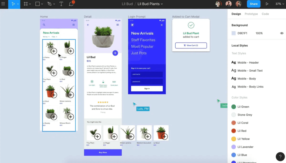 How to Design Like a Front-End DesignerTo understand how these new design tools can help, you need to know how front-end designers think differently from designers who cannot code. This difference basically boils down to the fact that a front-end designer understands how design decisions impact development and what developer-friendly design looks like. So let’s look at how a no-code designer can design like a front-end designer, based on what development-friendly design looks like. There are four areas that no-code designers often fail to give adequate consideration. These are:
Let’s explore each in turn looking at what mistakes are made and how modern design tools can help. Use a Fluid GridAlthough most designers design with a grid and often produce mockups for desktop and mobile screen sizes, from a development standpoint, that is nowhere near enough. Developers need to consider how the design scales all the way from desktop, incrementally down to mobile, and ensure it is usable at every point in between, not just two sizes. Thankfully tools like Figma offer three tools that can help no-code designers approach fluid grids more like a front-end designer would. You can create layout grids that allow you to build a design around fluid columns for a start. 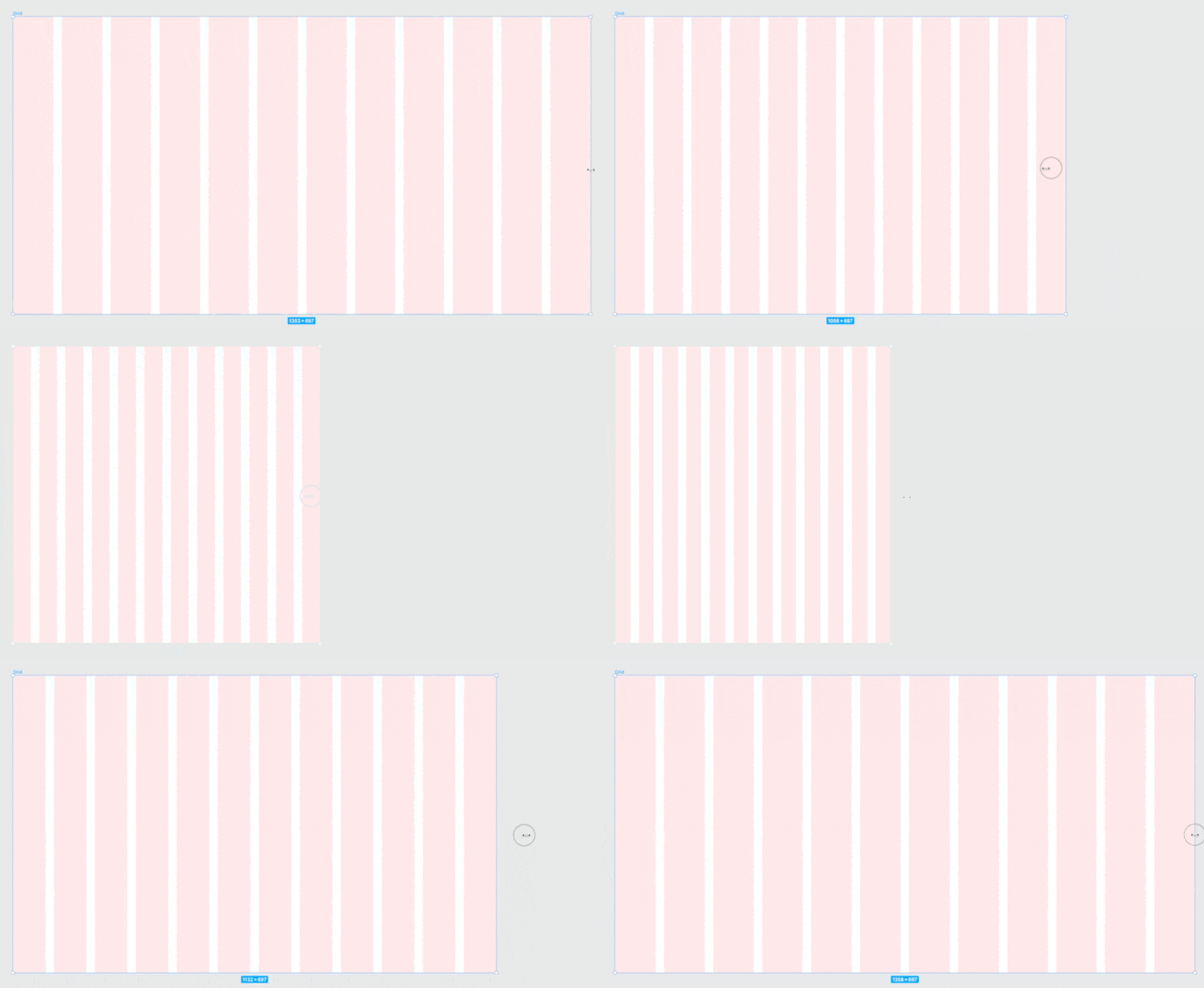 In addition, there is auto-layout functionality that enables you to build scalable design elements that adapt as the canvas is resized. 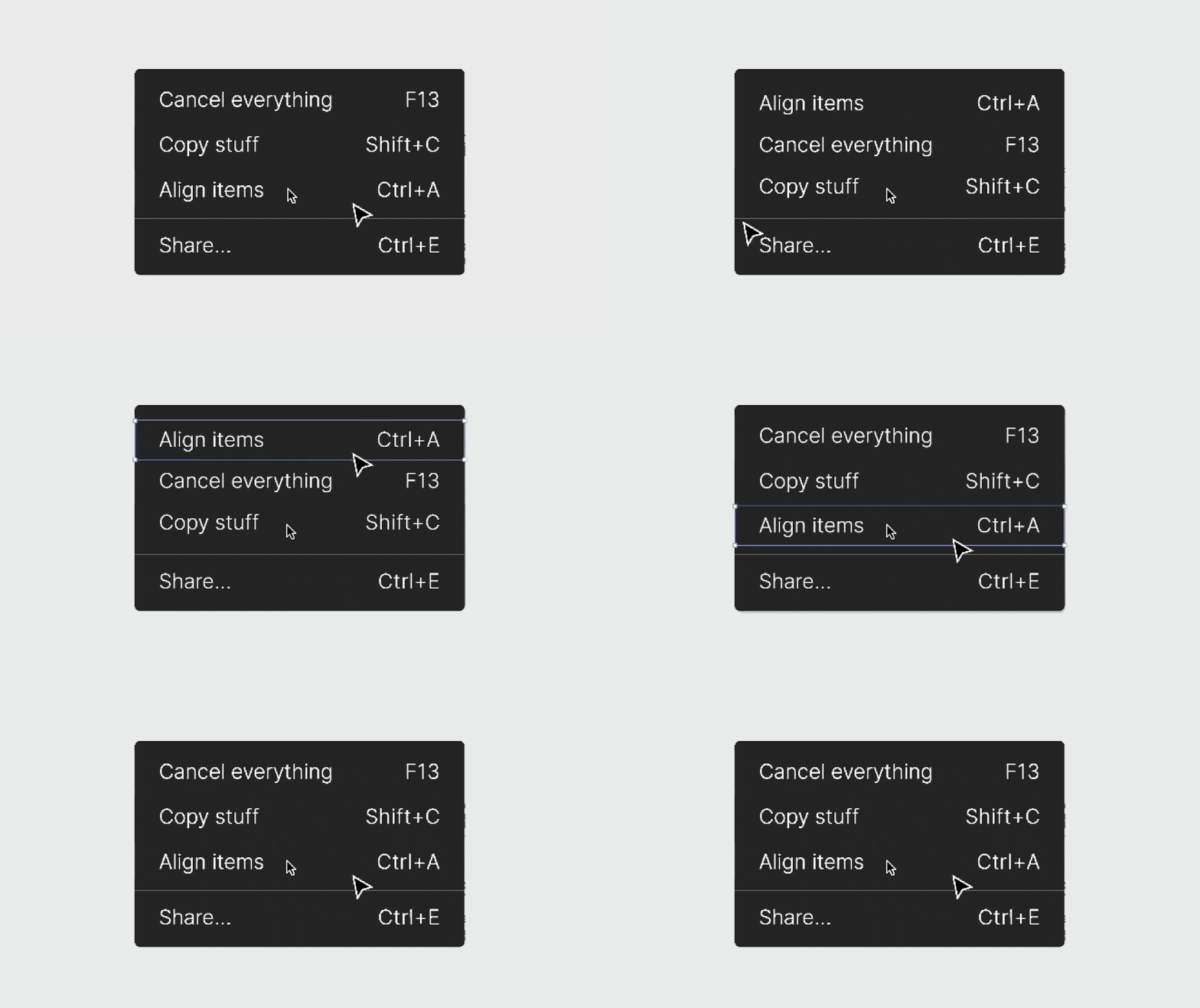 Finally, some excellent plugins like the Breakpoints plugin for Figma allow you to specify where the layout needs to reformat to accommodate different page widths. 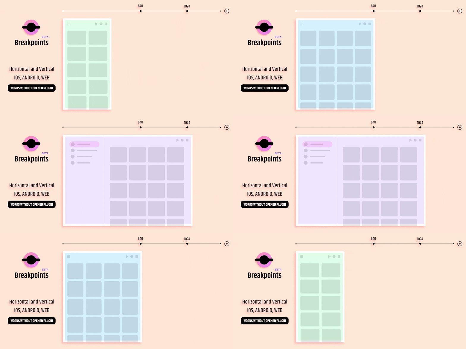 Using a breakpoint plugin has the added benefit of encouraging you to create breakpoints at the appropriate place for the content rather than standard device sizes. But these tools don’t just help with building fluid design, it also supports design consistency. Make it ConsistentKeeping the code of a website as lightweight as possible makes it more manageable and improves download speeds. Unfortunately, inconsistencies in the designs developers receive often make this challenging. For example, it is not uncommon for font sizing, padding, margins, and even colors to vary across a design. Each variation needs to be separately coded, taking additional time and leading to bloated code. Once again, design tools can help to ensure this consistency if used appropriately. 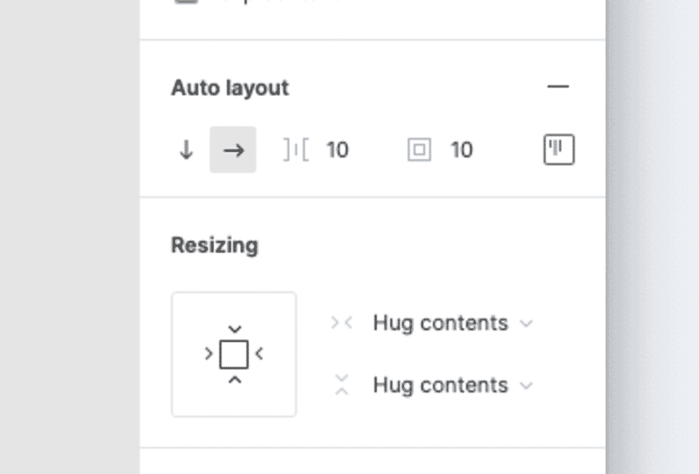 For example, you can use the auto-layout feature to specify consistent margins between and around design components. You can also create color palettes to ensure you use the same colors consistently across the interface. This not only helps the developer, but it also makes updating colors easier as you only have to update it in one place in the app, rather than every individual occurrence. 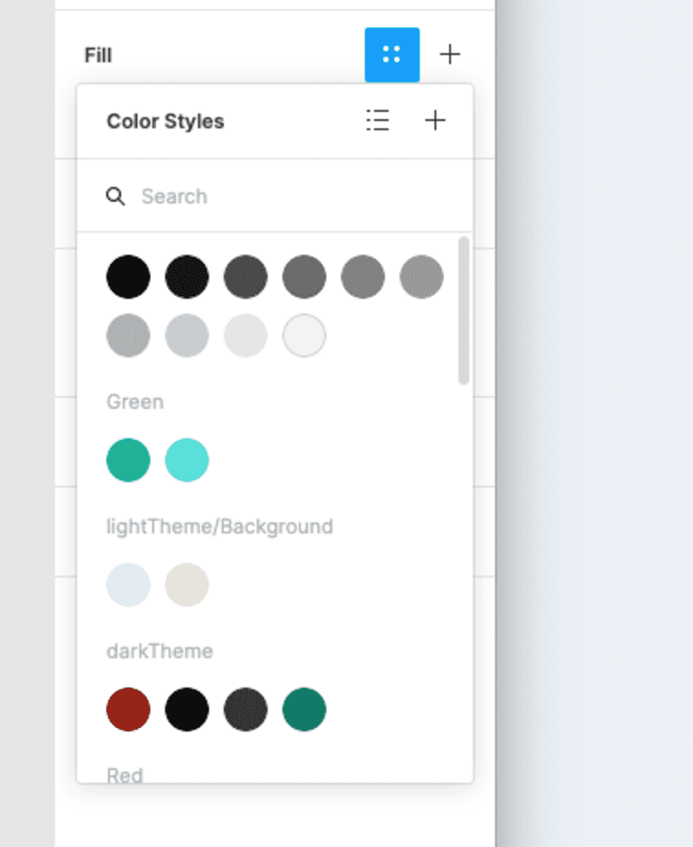 Finally, there are typestyles. Often designers who do not code tend to set type based on what looks right in a certain context rather than on a consistent set of rules. On the other hand, a front-end designer will be thinking in terms of stying different HTML tags irrespective of the specific page they are found on. That is not to say you cannot override styles in specific circumstances. However, by having the base styling, we ensure a consistent approach when coding. In fact, there is one more way of ensuring consistency, and that is to create a set of reusable components. However, that introduces the bigger topic of reusability. Make it ReusableFront-end designers know that developers favor reusing code. In fact, developers often use something called includes. A component like a newsletter sign-up form or a site header is written once and then pulled into any page that needs these elements. The advantage of this approach is that you can change the code for your include in one place, and it will update every page that uses that include. Thinking in terms of reusable interface elements is a critical part of front-end design. It is where the idea of pattern libraries was born. Fortunately, modern design apps like Figma or Sketch support this approach using components. You can design a component like a form or a header once and then drop it into every page you are working on. Then, when you need to change that component, you can edit it once rather than edit every occurrence.  This approach ensures consistency in the use of components and mimics the development process. However, it will also save the designer time when the client wants to make changes that impact multiple pages. Consider StatesThe final area that front-end designers consider and no-code designers often overlook is states. For example, a button may have:
Each state needs designing, but too often, a no-code designer will forget to do this work. That is equally true for error messages and validation. The problem is that no-code designers tend to think in terms of static design comps and not in terms of interactions. Once again, apps like Figma can help to start shifting this thinking. The prototyping functions allow you to show these interactions, while the components we talked about earlier can be nested and easily swapped between different states. 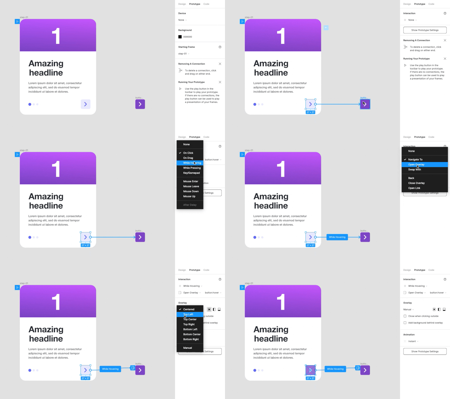 Front-End Designer MindsetUltimately the point I am trying to make in this post is that the value of a front-end designer is not so much in their ability to code as their ability to think like a developer. The ability to write CSS, HTML, and Javascript is useful, but a front-end designer will never be able to code as well as a developer. However, with that ability to code also comes the mindset needed to produce designs that are developer-friendly. Fortunately, increasingly the tools we use to produce designs gently nudge designers to adopt this kind of mindset anyway. So, if you were to ask me whether you need to learn to code, I would probably say no. But I would say you need to learn to use tools like Figma in the most efficient way possible because in doing so, you will start thinking like a front-end designer. |
| You are subscribed to email updates from Paul Boag - User Experience Advice. To stop receiving these emails, you may unsubscribe now. | Email delivery powered by Google |
| Google, 1600 Amphitheatre Parkway, Mountain View, CA 94043, United States | |

No comments:
Post a Comment